A chart is a visual representation of data, in which the data are represented by symbols such as bars in abar chart or lines in a line chart.[1] A chart can represent tabular numeric data, functions or some kinds of qualitative structures.
Overview
The term "chart" as a visual representation of data has multiple meanings.
- A data chart is a type of diagram or graph, that organizes and represents a set of numerical or qualitative data.
- Maps that are ardorned with extra information for some specific purpose are often known as charts, such as a nautical chart or aeronautical chart.
- Other domain specific constructs are sometimes called charts, such as the chord chart in music notation or a record chart for album popularity.
Charts are often used to ease understanding of large quantities of data and the relationships between parts of the data. Charts can usually be read more quickly than the raw data that they are produced from. They are used in a wide variety of fields, and can be created by hand (often ongraph paper) or by computer using a charting application. Certain types of charts are more useful for presenting a given data set than others. For example, data that presents percentages in different groups (such as "satisfied, not satisfied, unsure") are often displayed in a pie chart, but may be more easily understood when presented in a horizontal bar chart[citation needed]. On the other hand, data that represents numbers that change over a period of time (such as "annual revenue from 1990 to 2000") might be best shown as a line chart.
Types of charts
[edit]Common charts
Four of the most common charts are:
This gallery shows:
- A histogram typically shows the quantity of points that fall within various numeric ranges (or bins).
- A bar chart uses bars to show frequencies or values for different categories.
- A pie chart shows percentage values as a slice of a pie.
- A line chart is a two-dimensional scatterplot of ordered observations where the observations are connected following their order.
Other common charts are:
 |  |  |  |
 |  |  |  |
[edit]Less-common charts
Examples of less common charts are:
 |  |  |  |
This gallery shows:
- A bubble chart is a two-dimensional scatterplot where a third variable is represented by the size of the points.
- A Polar area diagram developed by Florence Nightingale is an enhanced form of pie chart.
- A radar chart or "spider chart" is a two-dimensional chart of three or more quantitative variables represented on axes starting from the same point.
- A waterfall chart also known as a "Walk" chart, is a special type of floating-column chart.
[edit]Field-Specific Charts
Some types of charts have specific uses in a certain field
 |  |
This gallery shows:
- Stock market prices are often depicted with a open-high-low-close chart with a traditional bar chart of volume at the bottom.
- Candlestick charts are another type of bar chart used to describe price movements of an equity over time.[2]
- A Kagi chart is a time-independent stock tracking chart that attempts to minimise noise.
- Alternatively, where less detail is required and chart size is paramount, a Sparkline may be used.
Other examples:
- Interest rates, temperatures, etc., at the close of the period are plotted with a line chart.
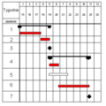
- Project planners use a Gantt chart to show the timing of tasks as they occur over time.
[edit]Well-known named charts
Some of the more well known named charts are:
 |  |  |  |
Some specific charts have become well known by effectively explaining a phenomenon or idea.
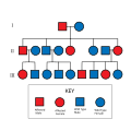
- An Allele chart is a chart originating from the study of genetics to show the interaction of two data points in a grid.
- A Gantt chart helps in scheduling complex projects.
- The Nolan chart is a libertarian political chart.
- A PERT chart is often used in project management.
- The Pournelle chart is a political chart to categorize state and rational ideologies.
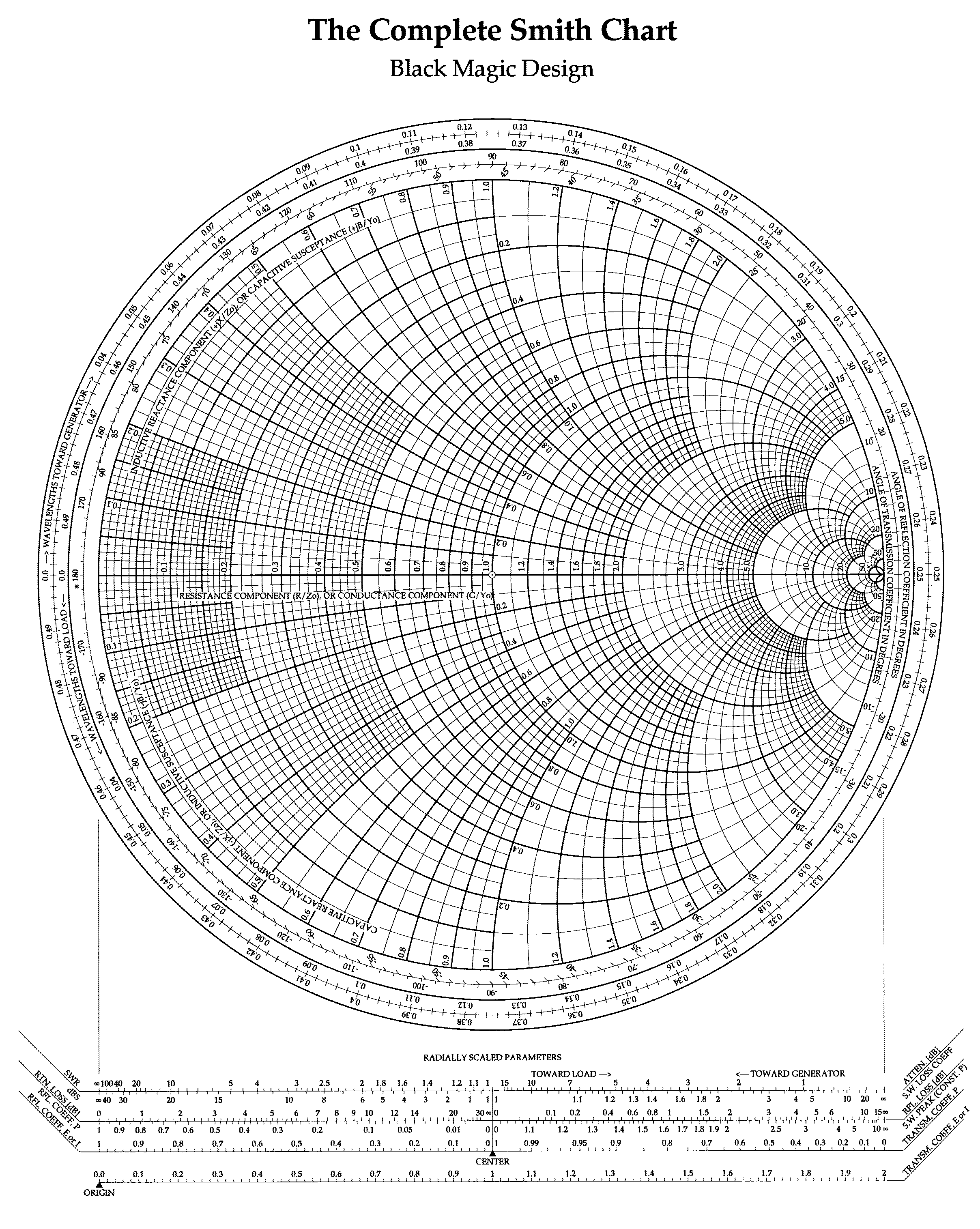
- The Smith chart serves in radio electronics.
[edit]Other charts
There are dozens of other types of charts. Here are some of them:
 |  |  |  |
 |  |  |
[edit]Common plots
 |  |  |


0 Comments
Add A Comment